Brand Evolution
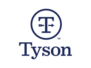
The weathervane is the farmer’s compass, it signals direction. At Tyson Foods, our compass points forward. Our “T” monogram creates a crest that speaks to both the direction of the company — always moving forward, focused on the future, raising expectations — and its strong family roots.
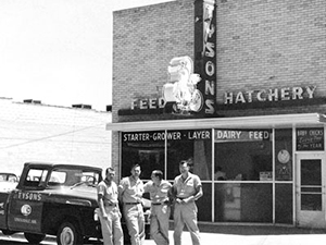
In the late 1930s, John W. Tyson establishes the foundation for one of the world's largest protein businesses: Tyson’s Feed & Hatchery.
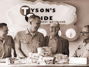
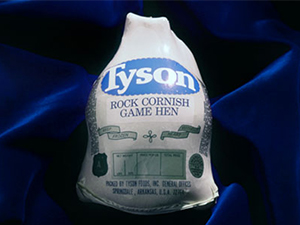
During the late 1950s and into the 1960s, Tyson products are marketed under the Tyson’s Pride® brand.
In the 1960s, Buddy Wray, former Tyson Foods President and COO designs the first oval logo.
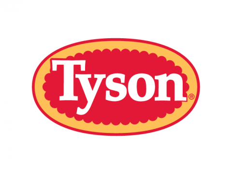
In 1972, the company name changes to Tyson Foods, Inc. but the “Big Red” logo continues to be used for a time.
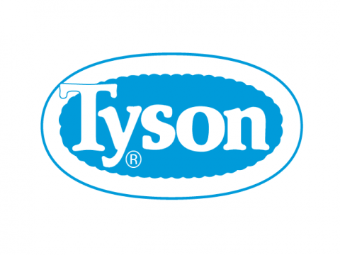
In 1972, the blue and white oval logo first appears in the Tyson Foods Annual Report.
By 1973, a red outline is added around the blue and white oval logo. Between 1975 and 1978, the logo colors change to be more attractive in grocers’ display cases.
In 1995, the Tyson logo is redesigned to strengthen the company’s colors and make the image bolder.
In 2005, the logo is updated and made more readable and easily recognized by consumers.
While our oval logo remains for our consumer brand, our new corporate logo ushers in a new, modern look.